Living Room Color Schemes That Age Well
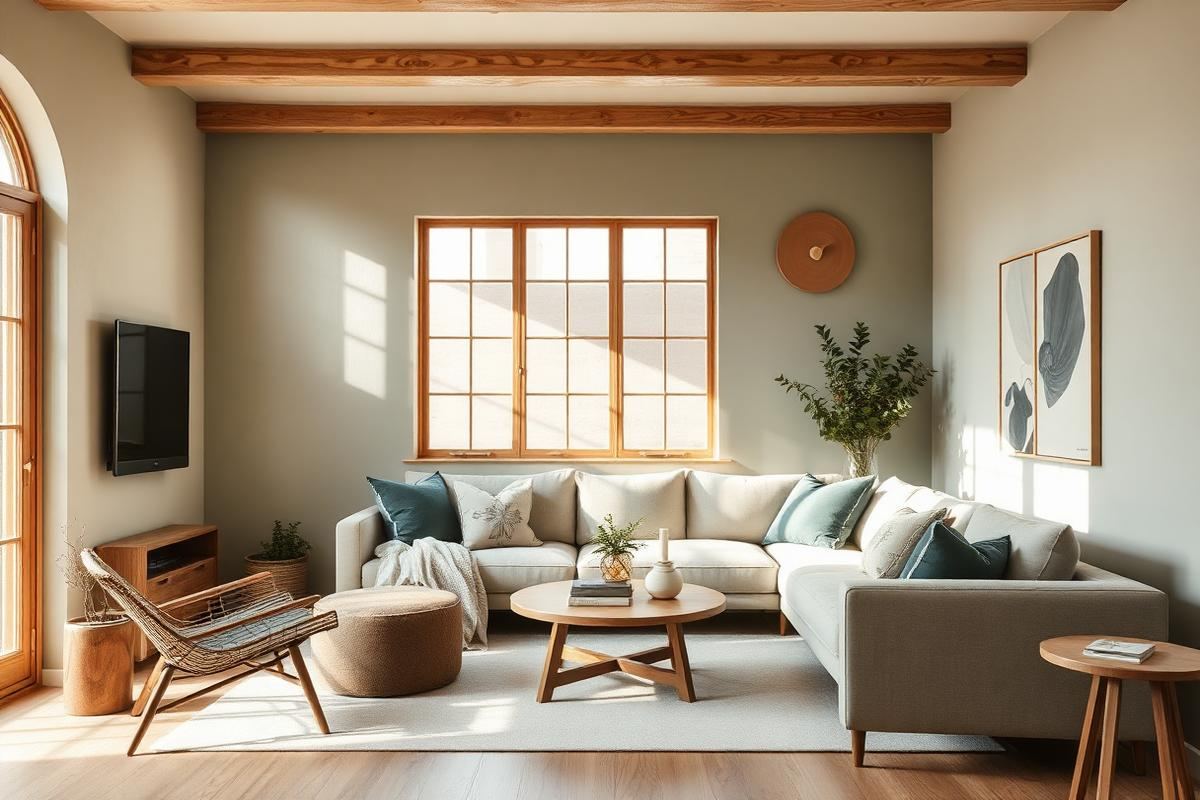
Living Room Color Schemes That Age Well is one of those topics where a little planning goes a long way. In this guide I walk through the process we use in real homes — not just what looks good in a photo, but what actually holds up over time.
Start here
Before you buy or move anything, measure the space and note how you actually use it. The best-looking room is one that matches how you live, so start with the routines: where you sit, where you drop keys, where the light falls in the afternoon.
The essentials
Focus on the pieces that do the most work. Get those right and the rest of the room comes together with much less effort. Aim for materials that patina rather than degrade, and colors you will still like in five years.
- Choose one clear focal point per room.
- Pick materials that improve with age.
- Layer textures instead of adding more colors.
- Leave visual breathing room — negative space is a design element.
Common mistakes
The mistakes we see most often are matching everything too tightly, over-scaling accessories, and skipping proper lighting. Fix those three and most rooms improve overnight.
The Art of the Hue: Choosing Your Anchor
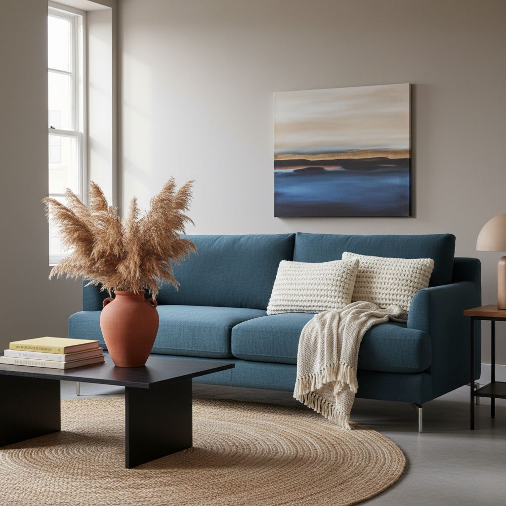
Before you even think about accent pillows, the foundation of an enduring living room color scheme is a well-considered anchor color. This isn't just about what's 'on trend' this season, but about the long-term emotional impact and versatility. A common mistake is to choose a vibrant, trendy color for large surfaces like walls or a primary sofa, only to tire of it within a year or two. Instead, opt for sophisticated neutrals or muted, earth-toned colors that can serve as a timeless backdrop. Think 'expensive canvas' rather than 'bold statement wall'.
Sophia's Tip: Anchor Hues for Longevity
- Warm Greys (e.g., Benjamin Moore's 'Revere Pewter' or Farrow & Ball's 'Elephant's Breath'): Offer a soft, inviting base that pairs beautifully with almost any secondary color.
- Soft Whites/Off-Whites (e.g., Sherwin-Williams' 'Alabaster' or 'Greek Villa'): Provide a clean, airy feel without the starkness of true white, allowing other elements to shine.
- Muted Greens (e.g., Behr's 'Sagebrush Green' or Farrow & Ball's 'French Gray'): Introduce a sense of calm and connection to nature, offering a subtle pop of color without overwhelming the space.
These hues, while seemingly understated, possess incredible depth and adaptability. They allow for seasonal shifts in décor through smaller, interchangeable items, making your living room feel fresh without a complete overhaul.
Layering Textures for Dimension and Warmth
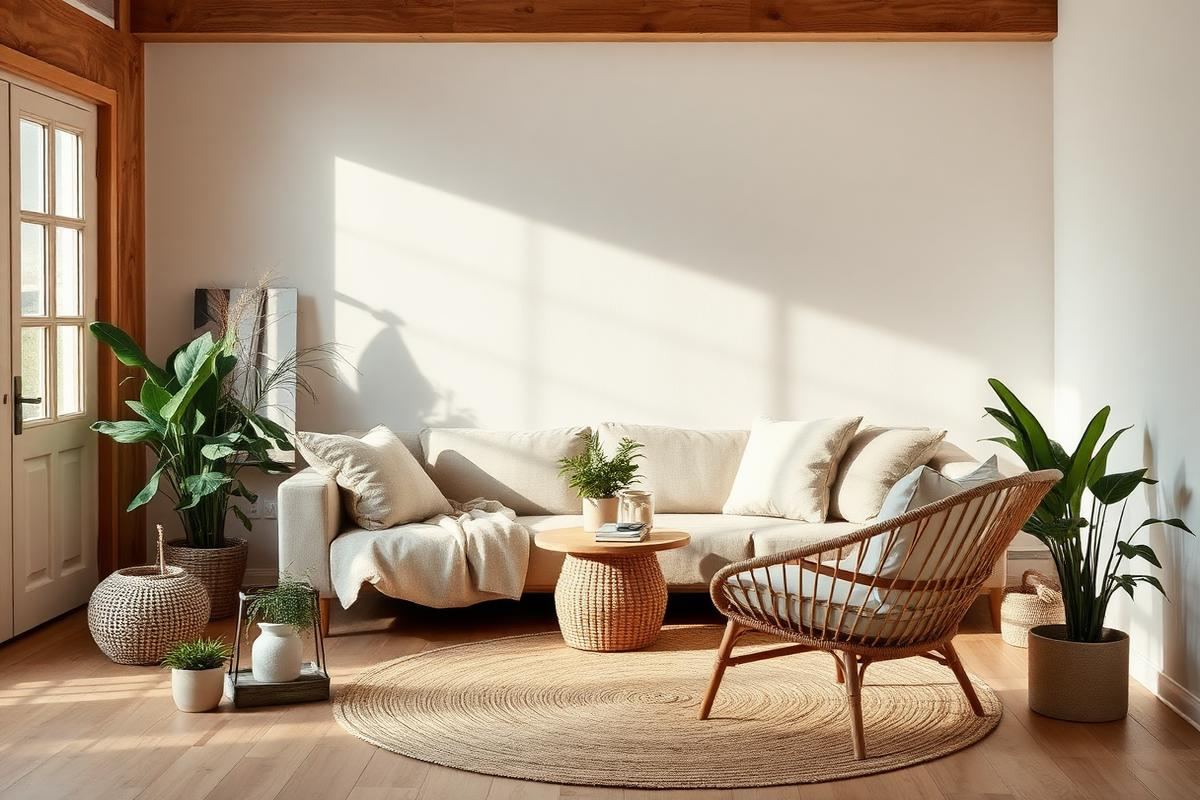
A monochromatic or limited-palette living room can fall flat without intentional texture layering. This is where your color scheme truly comes alive, adding depth and tactile interest that transcends mere hue. Consider a living room with walls painted in a soft off-white. The absence of bold color could feel sterile, but introducing varied textures creates a rich, inviting atmosphere. Imagine a cream linen sofa priced at around $1,500-$2,500, topped with oversized, chunky knit throw pillows (two 20"x20" costing $40-$60 each) in a slightly darker ecru, and draped with a cashmere blend throw blanket (typically $80-$150) that feels luxurious to the touch. This approach adds visual weight and comfort without introducing new colors.
Further, anchoring the space with a large wool or jute rug (a 8'x10' can range from $300-$800) not only defines the area but also brings a natural, grounding element. Even smaller details like a ceramic vase (from $20-$70) with a matte finish or a glossy lacquered side table (from $150-$400) contribute to the textural story. The interplay of soft, hard, rough, and smooth surfaces is crucial for a living room color scheme that feels complete and 'lived-in' rather than just 'decorated.'
The Power of the 20%: Balance and Accents
The 60-30-10 rule is widely recognized, but for long-lasting appeal, I often advocate for a more conservative 70-20-10 approach: 70% anchor, 20% secondary, and just 10% accent. The 20% represents your opportunity to introduce a secondary color that complements your anchor but adds a subtle layer of visual interest. This color should still be relatively muted or sophisticated to ensure longevity. For instance, if your walls are a warm grey, your secondary 20% could be incorporated through a sofa in a deep, muted petrol blue (a high-quality commercial sofa can cost $2,000-$5,000) or a pair of upholstered armchairs in a timeless forest green velvet (around $700-$1,200 per chair).
The key here is choosing materials that elevate the color. A cheap fabric in a sophisticated hue will still look cheap. Invest in quality upholstery for your 20%. This secondary color should harmonize, not compete, with your anchor. It binds the room together, providing a coherent visual narrative. Avoid using this 20% for fleeting trends like a 'color of the year' if you want your scheme to truly endure.
Strategic Pops of 10%: Refreshing Your Space
The final 10% of your color scheme is where you can have fun, experiment, and embrace trends without committing to a costly overhaul. This small percentage is dedicated to your true accent colors – the ones that inject personality and can be easily swapped out as tastes evolve or seasons change. Think small-scale items that are relatively inexpensive to replace. For example, if your anchor is warm grey and your secondary is petrol blue, your 10% could be vibrant terracotta throw pillows (two 18"x18" for around $30-$50 each), a mustard yellow decorative vase ($25-$60), or even fresh flowers in a seasonal hue (weekly cost: $15-$40).
A common mistake is treating large art pieces as part of this 10%. While art offers a pop of color, a significant investment in a large canvas should ideally complement your 70% and 20% colors for long-term appeal. The 10% is for those vibrant, punchy details: a stack of colorful coffee table books, a ceramic tray, or even a statement lamp shade. These are the elements that allow you to quickly 're-style' your living room and keep it feeling current without touching the paint or making major furniture purchases, truly making your living room color scheme age gracefully.
Key takeaways
- Match the room to how you actually live.
- Anchor with one main piece and clear lighting.
- Layer textures, not colors.
- Leave breathing room around every object.
Frequently asked questions
Where should I start?
Start with the largest piece and the light. Everything else — art, textiles, small objects — is easier to place once those two anchors are set.
What is a realistic budget?
Prioritize the pieces you touch every day. Spend more on those and less on decorative items, which are easy to swap over time.
How long should this last?
A well-chosen main piece should last 10–15 years. Refreshes come through textiles, art, and accessories, not full replacements.

Sophia Bennett is a certified interior stylist and the senior editor at Maison Bloom. She has spent more than eight years helping homeowners and renters create warm, functional interiors, with hands-on experience across small city apartments and family homes. Her work has been informed by close collaboration with independent designers, craftspeople, and product testers.
View full profile →Related reading
How to Choose a Sofa: The Complete Buyer's Guide
A good sofa lasts fifteen years. Here is how to make sure the one you buy is one of them.
How to Build a Warm Neutral Color Palette for Your Home
Warm neutrals are the safest and most flattering base for a whole-home palette. Here is how to build one on purpose.
Sustainable Home Decor Basics: What Actually Matters
Sustainable decor is not one label or one shop. It is a small number of decisions that compound.